CONTENT STRATEGIST – FIDELITY INVESTMENTS
- I craft user experiences that empower both retail and institutional investors to
confidently navigate Fidelity’s investment platforms. Through thoughtful content
strategy and clear, empathetic UX writing, I translate complex financial concepts into language that’s accessible, actionable, and investor-friendly.. - I also audit existing content to identify gaps and opportunities, including helping to simplify and streamline onboarding, account creation, and portfolio management.
- Some of my recent work includes …
- Encouraging a broad range of cross-functional teams to align with content standards
- Implementing a clearer and more conversational tone across the application
- Working with UXR and UXD to test, refine, and iterate, producing more customer-centric digital experiences
CONTENT DESIGN MANAGER – INTUIT MAILCHIMP
- I managed a team of content designers and copywriters, who designed prospect-focused experiences — including the homepage, feature pages, pricing, and various marketing campaign landers. We also optimized navigation and onboarding flows.
- I collaborated with marketing, research, support, design, and product teams to understand requirements, user needs, and business goals. Ultimately, our collective goal was to create user experiences that increased conversion.
- I also helped plan large-scale content evaluation efforts and identified opportunities for content testing, based on analytics, user feedback, and other performance data.
- I facilitated content critiques and advised cross-functional partners on content standards.
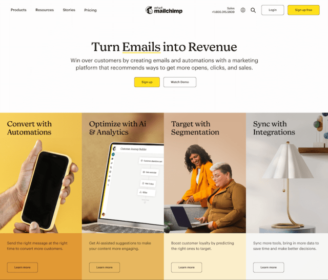
Intuit Mailchimp Case Study 1: HOMEPAGE REDESIGN
I personally managed a content refresh of Mailchimp.com (focus on home, feature, and pricing pages) in the summer of 2022. Working with marketing, customer research, and product design, I created a messaging framework and, ultimately, wrote copy that showcased unique value propositions, benefits, and compelling claims and social proofs.
As a result, paid conversions increased by 4%


Intuit Mailchimp Case Study 2: GUIDED PLAN SELECTOR
Our research showed that prospects were impressed by the range of Mailchimp’s features but confused about how they were bundled or priced to fit their needs.
To address this, we created the Guided Plan Selector (internal name), a wizard that matched prospects with the right pricing plan based on their business goals, team size, and monthly email sends.
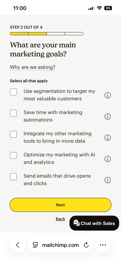
By collaborating with cross-functional partners and incorporating research and sales insights — including some of the questions reps asked prospects on sales calls — I helped develop a personalized onboarding experience that, ultimately, helped increase conversions by 7% and reduced churn.
Watch this short video for a walkthrough of my content design work and its impact on the user experience.

UX Writer, Content designer – Google
I optimized content in the tool advertisers use to create and serve campaigns across Google’s surfaces — including Discover, YouTube and Gmail.
Specifically, I …
- translated complex concepts about bidding, budgeting, and audience targeting into clear, trustworthy, conversational language
- determined the right content for where users were in their journey (i.e. attract, convert, onboard, engage, support)
- partnered with UX design, research, product management, program management, and engineering to ensure a cohesive brand experience throughout the customer journey
- crafted solutions that were authentic to Google’s brand values and aligned with cross-platform UXW standards
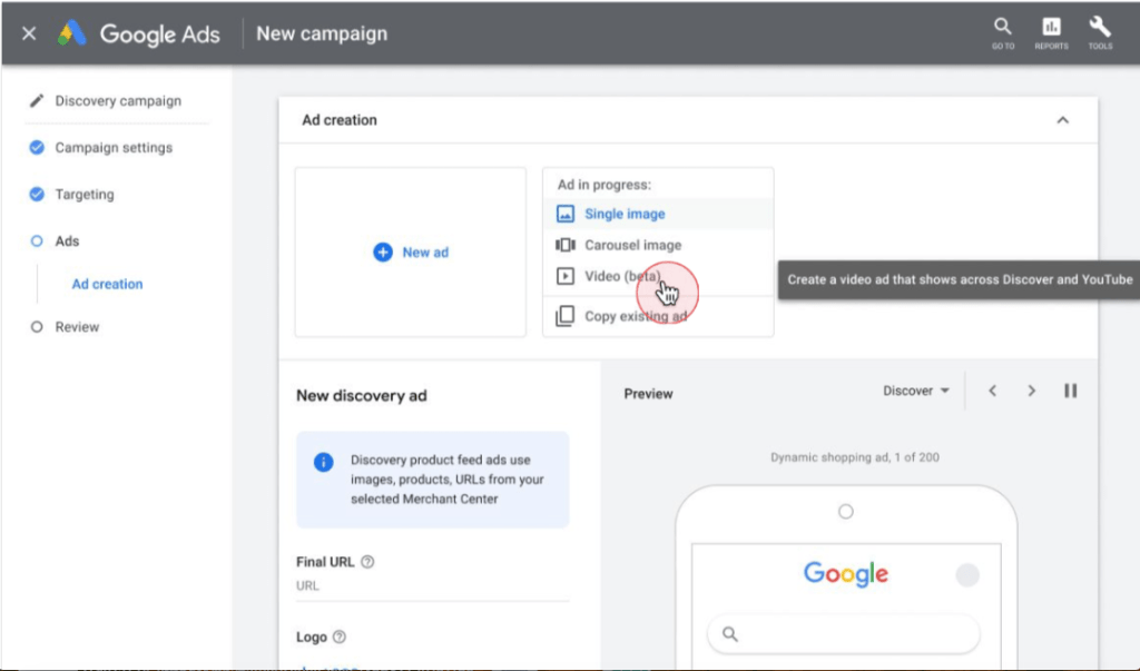
Google Case Study 1: Content design for Google’s Discovery Video Ads
I was the UX writer and content designer on a new Google Ads product sponsored by the upper echelon of Google’s leadership:
Allow advertisers to create video ad campaigns that serve across YouTube, Discover, and Gmail. Make the user experience intuitive, efficient, delightful.
User need:
Video ads are one of the most engaging ways to present commercial content to users. Internal research told us our advertisers expected Google Ads to have parity with other social ad platforms like Facebook and TikTok, which offered a range of media-rich formats to businesses and brands eager to engage and convert users.
Content Design objective:
- Allow Google advertisers unfamiliar with the new video format to easily add it during campaign construction
- Give them the ability to select/ remove YouTube videos from the media picker
- Show advertisers a preview of their ad in popular Discovery video ad surfaces, and let them know key info about format compatibility constraints
- Give other guidance, warnings and error states in context


Google Case Study 2: Nudge to encourage certain users to switch to more successful strategy
In this case, the system knows the advertiser will benefit by switching to a different bidding strategy, based on the budget value they’ve entered (not pictured). The goal here is not to warn or push the advertiser, but to let them know how switching can help maximize return on investment (ROI).
[nudge]
Focusing on conversion value can improve your campaign’s performance by maximizing the value of your conversions based on your target return on ad spend.
[cta]
Use conversion value
Version 1: A decent early iteration highlights what the suggested action will do, but gets mired in language that is, at once, too vague and too technical — even for advertisers familiar with a certain amount of jargon (i.e. “various signals”).
It includes a benefit advertisers will understand (“maximize conversion values”), but doesn’t draw the direct line to an overarching strategic goal — improving the campaign’s performance.

Version 2: A subtle revision to the string emphasizes how the suggested action will improve the advertiser’s campaign performance. This version is more direct and compelling, getting to the why before the what.

Version 2 with more context and rationale
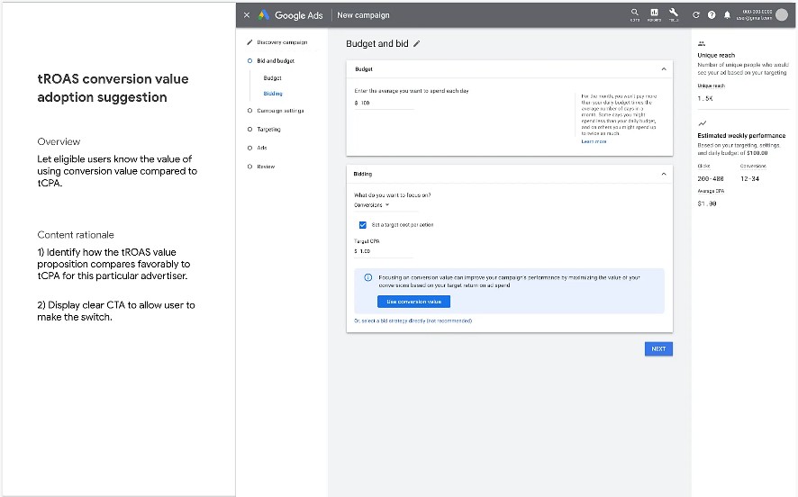
Key metrics
- Adoption rate (from tCPA to tROAS)
- Spend rate
- Average revenue per lead (ROI, essentially)
Google Case Study 3: Warning to identify issue and provide fix
In this case, the user has switched their bidding strategy, but the system knows that the value they’ve entered might return suboptimal results. The scenario required a callout with a more urgent suggestion: a warning, that would identify the issue and suggest corrective action and indicate why it was being recommended.
[warning content]
Your campaign may reach very few people because your target return on ad spend is too high. Try setting it to 20% to reach more people.
Suggested based on typical targets from high-performing Discovery campaigns
[cta]
Set target to 20%

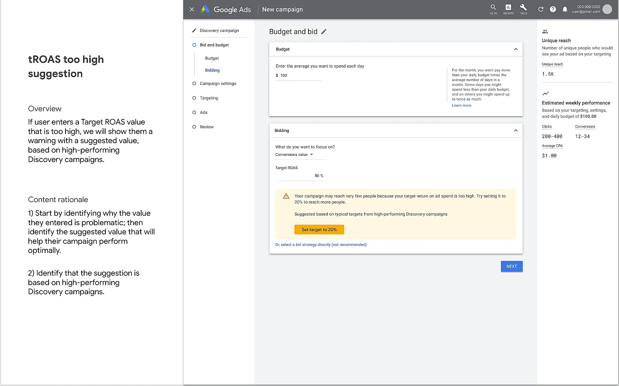
Key metrics
- Serve rate (did the ad run more frequently, based on the adjusted value)
- Audience reach (did the ad reach intended audience more effectively)
CONTENT STRATEGIST – NBC UNIVERSAL
I worked as a key member of the product and UX team that helped improve BravoTV’s and Oxygen’s mobile web experience. I also gathered and refined requirements to enhance NBCU’s federated video player and platform, and improved usability of the admin for managing blogs and image galleries.
NBCU Case Study: Reduce BravoTV.com’s mobile HP bounce rate
Working with UX design, I helped create a streamlined mobile content feed with consistently-labelled content and clear calls to action.
- Increasing engagement with clearer video CTAs
- One of the goals was to increase short-form video (sfv) viewing and engagement.
- I used Optimizely to A/B test placement of the play button CTA on video thumbnails (i.e. play button linked to video landing page)
- Through testing, we determined that the placement most users responded to was down in lower left-hand corner. Also, I recommended adding clip duration to give users a sense of length (we were specifically trying to drive short-form and not long-form viewing engagement).

left-aligned video CTA
- Consistent content labeling and timestamps for freshness
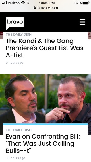
- A careful review of BravoTV’s analytics revealed that the site’s own blog posts were one of the primary drivers to related sfv attached to each blog post.
- BravoTV’s main blog was called The Daily Dish, a name with brand recognition among show fans. I suggested we add “The Daily Dish” label to each blog post in the mobile feed.
- To provide a sense of content freshness, I suggested we add a timestamp (i.e. “6 hours ago”) to each blog post. Prior to my work, the site wasn’t getting many repeat visitors on mobile. Afterwards, partly due to the time stamps that signaled the feed was actively updated with new content, repeat visits increased.
End result
Working with engineering, I also helped ensure faster load times.
The end result was a clearer, more compelling content feed with faster load times, all of which helped reduced bounce rates, encourage repeat visits, and increased engagement.

Key metrics
- Reduce Mobile HP bounce rate
- Increase short-form video (sfv) engagement
- Increase repeat visits
CONTENT STRATEGIST – ARTPARK
Home page promo
Challenge: Describe an abstract art installation in a way that will make people want to learn more about it.
Solution: Make it about people and the way they relate to each other.
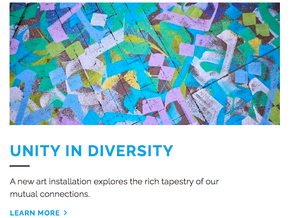
Hindsight is 20/20 improvement: “Learn more about installation” for better accessibility.
Ticketing info and button CTA
Challenge: Present an array of ticketing information in a way that makes it easy for users to quickly find what’s most relevant to them.
Before:
- Information hierarchy is muddled (info about chairs and carry-ons gets equal weight with General Admission header, for instance)
- “Click here for ticket map” is good information scent, especially considering “ticket map” was one of the most viewed and searched for pages. But the link is buried and it actually went to a seating map, which was confusing.
- Button CTA – “Tickets” – should be more explicit (“Buy Tickets”).

After:
- Clarified indoor/ outdoor seating options and provided clear and obvious CTA (i.e. “Seating Map”)
- Clearly identified ways to buy tickets (online, by phone, in person) and concisely conveyed related info.
Hindsight is 20/20 improvement: “Buy Online” instead of “Online” for better information scent.

Artist interviews and features
Challenge: Find a way to make classical and avant garde music relatable to concertgoers unfamiliar with those genres.
Solution: Understand that human beings make classical and avant garde music to communicate humor, passion, sorrow and joy to other human beings — it’s just that they’re doing it with their instruments. Research your subjects so that your genuine interest in them and “need to know” will spark the reader’s curiosity, too.
